Helpun. How it was built
A task planner whose system prompt tells Claude it is talking to an ADHD brain, and builds the rest of the app around what that actually requires.
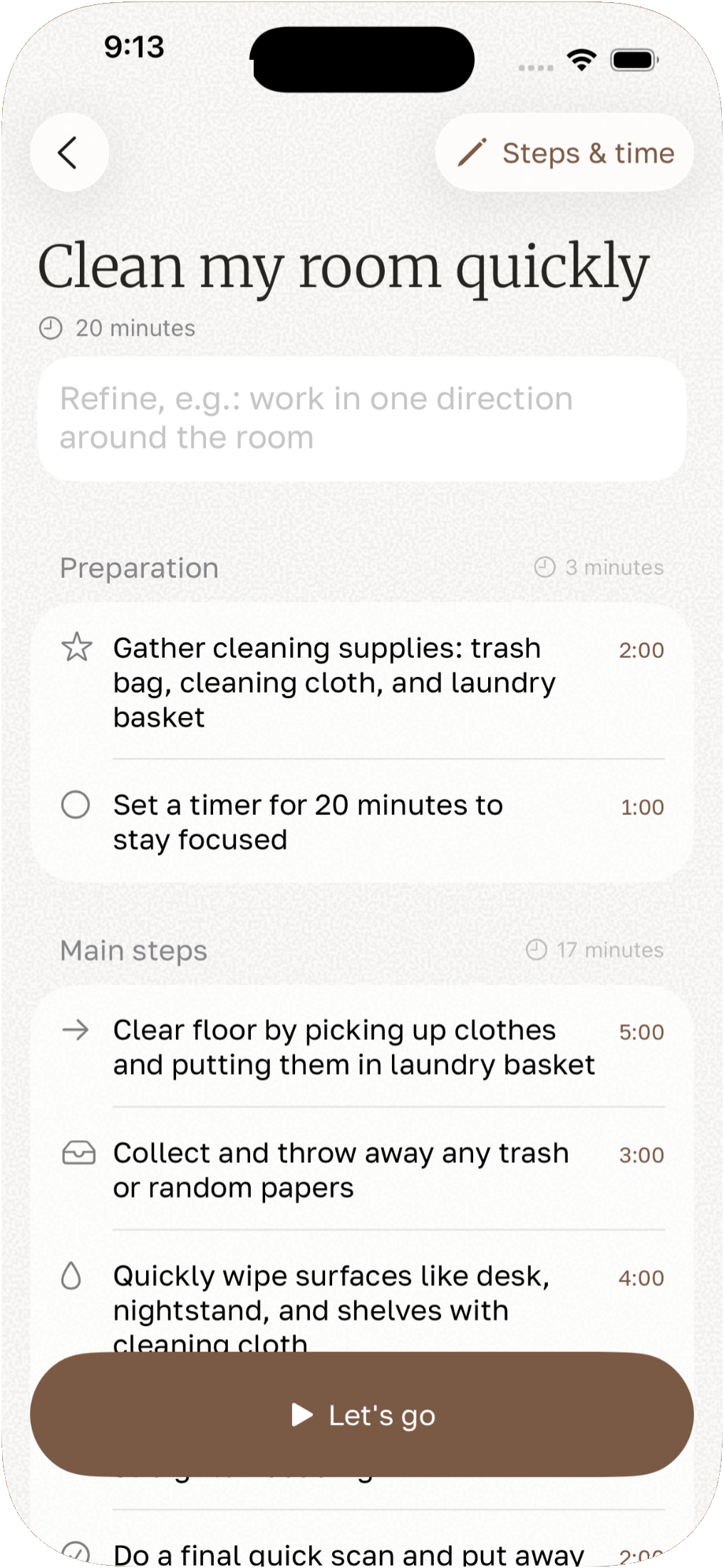
The system prompt Helpun sends to Claude opens with a sentence that decided most of the rest of the app: "You are an ADHD-specialized task breakdown assistant. Your purpose is reducing cognitive overwhelm through clear, actionable task decomposition."
That turns into a hard rule a few lines later: every step has to be a complete action, a verb, an object and a detail, and has to make sense without the step before it. "Vacuum the living room, starting from the far corner" passes. "Vacuuming:" does not, because a category header is a decision waiting to happen, and a decision is exactly what someone mid-task doesn't have spare attention for.
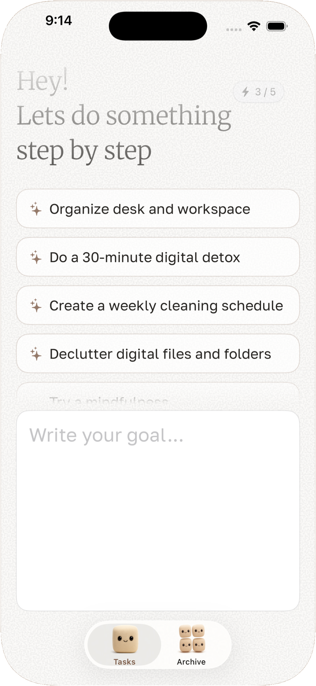
AI Planning & Breakdown
Goal prompt — the three starting suggestions aren't a fixed list: Claude writes new ones itself, in your phone's language, the first time you open the app.
Execution & Recommendations
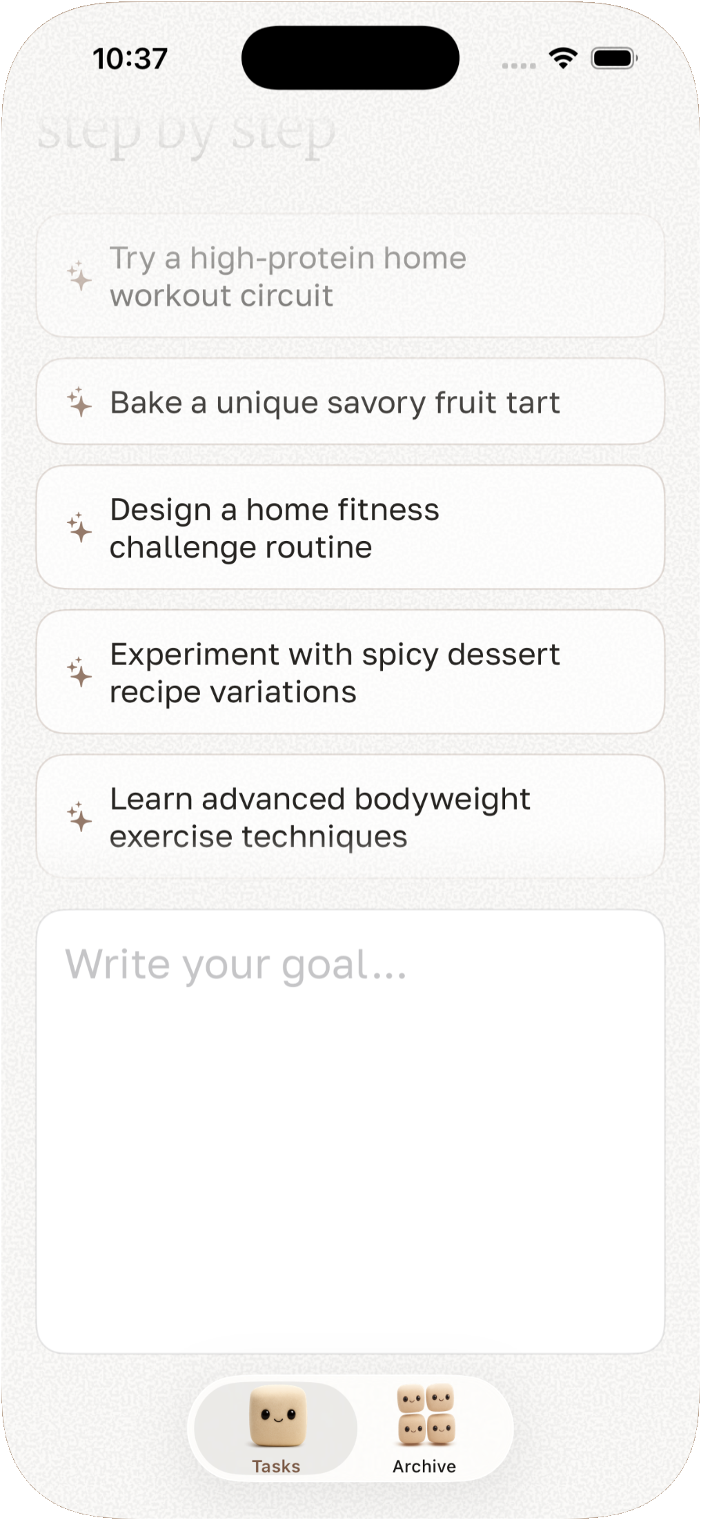
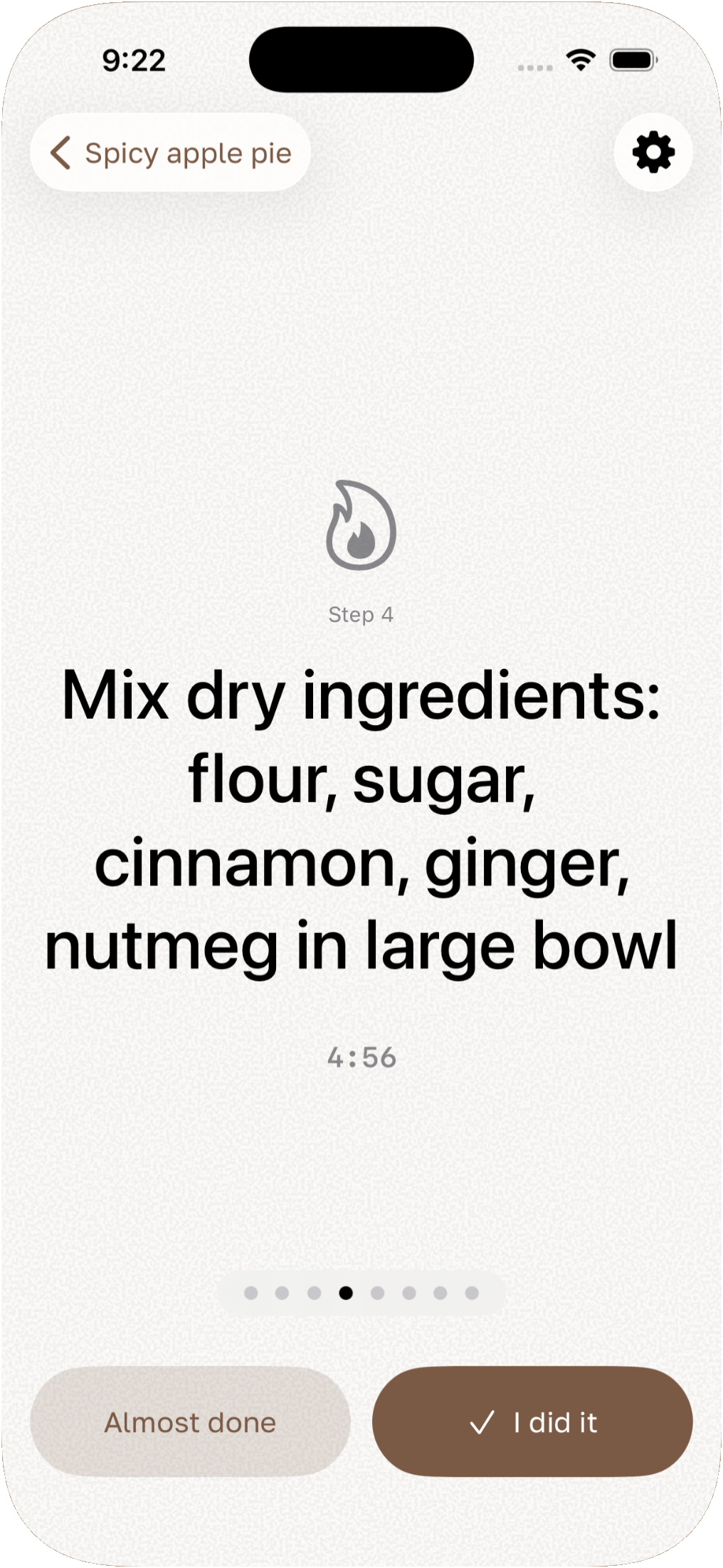
Step execution — hands-free voice navigation with built-in timers.
The step you're on, on the Lock Screen
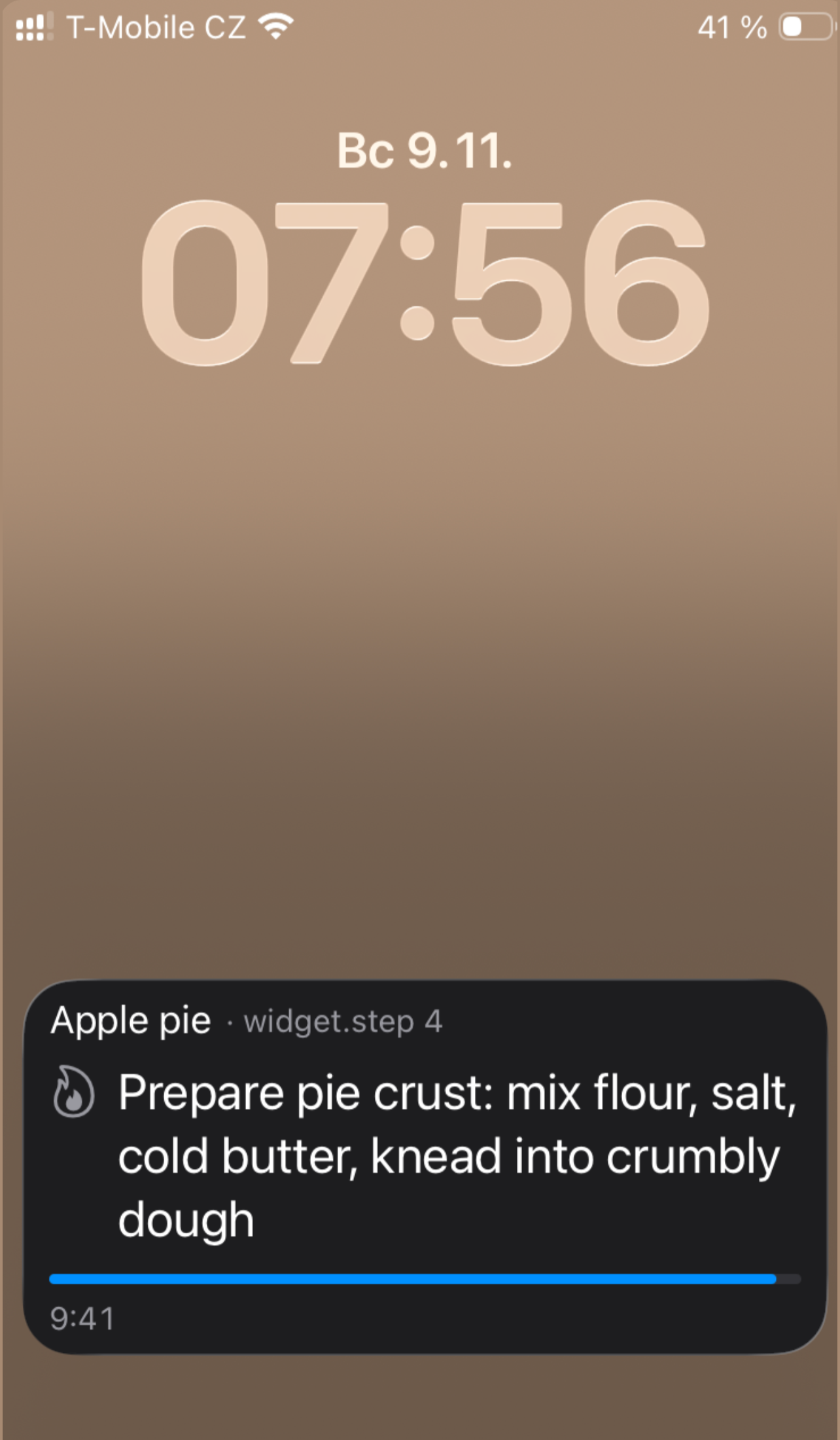
The point of breaking a task down is lost if getting back to it means unlocking the phone, finding the app and finding your place in it. So the current step lives on the Lock Screen as a Live Activity, with its own timer running, and Next and Previous buttons right there. Both buttons are plain deep links, taskshelp://next and taskshelp://prev, the same two the app would answer to if you said them out loud.
Voice reuses the same two words on purpose: "next" and "previous", nothing more elaborate, because by the time you need them your hands are in the flour or under the sink, and a command with room for misrecognition is a command you'll end up tapping through anyway. Steps carry their own time estimates, and repeat blocks handle workouts and routines. Anything Claude got wrong, you edit yourself: it proposes the plan, it doesn't own it.
Type the task, and the steps come back written down.
Why credits instead of a subscription
Every breakdown costs one credit, whether the task is "reply to an email" or "plan a wedding", because Claude charges roughly the same either way. A subscription would mean charging people who open the app twice a month the same as people who open it daily, so instead there are packs of 10 or 50 that never expire, bought once and spent down.
The balance shows up as a small badge next to the input box, and it does its own bookkeeping: brown at 5 credits or more, orange under 5, red at zero. Reopening a saved plan, unlike writing a new one, costs nothing at all: the steps are already sitting in Core Data, and asking Claude again would just spend a credit to get the same answer back.
Key Features
AI Task Breakdown
Enter any task and Claude AI generates a detailed, logical sequence of actionable steps.
Voice Navigation
Say "next step" or "previous" to navigate hands-free while working. No tapping required.
Built-in Timers
Each step can have a timer to help you stay focused and pace yourself through the task.
Task Archive
Save completed breakdowns and revisit successful workflows whenever you need them.
iCloud Sync
Tasks sync automatically across your iPhone and iPad via your private iCloud account.
Privacy-First
The request that reaches Claude reads "Now process this user task:" followed by exactly what you typed. Nothing else about you rides along, and everything else stays on the device and in your own iCloud.
Your hands stay in the work while your voice turns the page.
How It Works
-
01
Enter Your Task
Type what you want to accomplish, as specific or as vague as you like. Claude adapts to either.
-
02
AI Generates Steps
Claude analyzes your task and creates a clear, logical sequence. Refine it if needed.
-
03
Execute with Voice
Navigate through each step hands-free. Use the built-in timer to stay on pace.
-
04
Save and Reuse
Mark steps complete, save the breakdown, and reuse it next time you tackle the same task.
Only the title ever leaves the phone.
The one purely decorative choice in the whole app is the launch screen: a plush marshmallow mascot, photographed rather than illustrated, sitting still with a small smile while the app loads behind it. Everything else in the app answers a specific complaint about how task apps usually feel; the mascot is just there so the first thing you see isn't a cold list.
The closest thing to a second one is the confetti. Marking a step Almost done or I did it fires a short burst of small brown shapes straight out of the button, gone in under a second, there for no functional reason beyond making a checkbox feel like slightly more than a checkbox.
More projects