CSAT Survey Widget
Designing the company's first standardized satisfaction survey — from a blank brief to a dev-ready spec in 3 weeks.
Overview
Problem
The company had no standardized way to measure user satisfaction. Financial metrics and activity metrics existed, but no "voice of the user." Each product owner collected feedback independently — impossible to aggregate across the platform. Some feedback was only collected at cancellation — too late to act on.
C-level needed a monthly CSAT report to track satisfaction trends, trigger deep research, and predict churn before it happened.
Discovery
I started by mapping the strategic context — this wasn't just a UI component, it was infrastructure for a lifecycle metrics initiative. That framing shaped every decision.
-
01
Mapped 5 stakeholders with different priorities
C-level wanted monthly reporting. Design wanted quality. PM wanted methodology. Each had a different definition of "good."
-
02
Researched anti-patterns
No modal windows. No homepage placement. No third-party chat widgets. No forced surveys. Each of these actively reduces response quality or trust.
-
03
Challenged the initial brief
The brief proposed action-based triggers. I pushed back: time-based triggers reduce sampling bias and give a more representative picture. The team agreed.
-
04
Defined the target
300–400 responses/month from ~30K users at 95% confidence. That number drove the trigger frequency and placement decisions.
Key Design Decisions
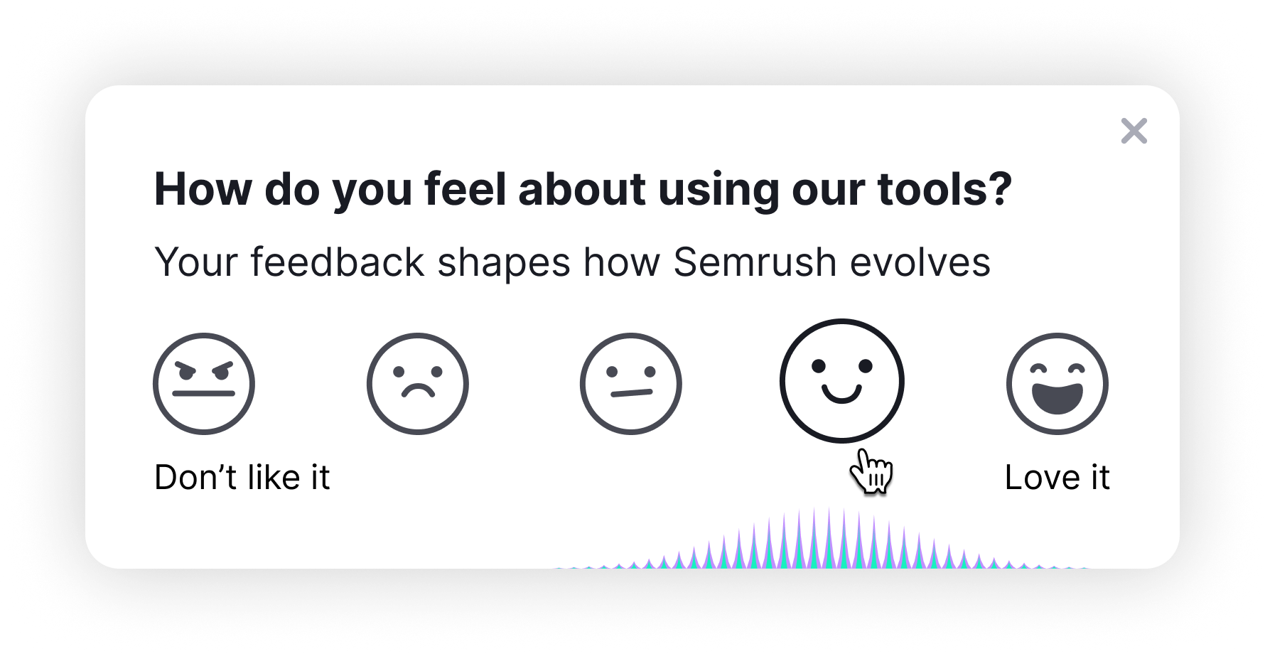
Toast popup, not modal
Non-blocking. Familiar pattern from Slack and macOS. Users can ignore it — which also means when they respond, they actually chose to.
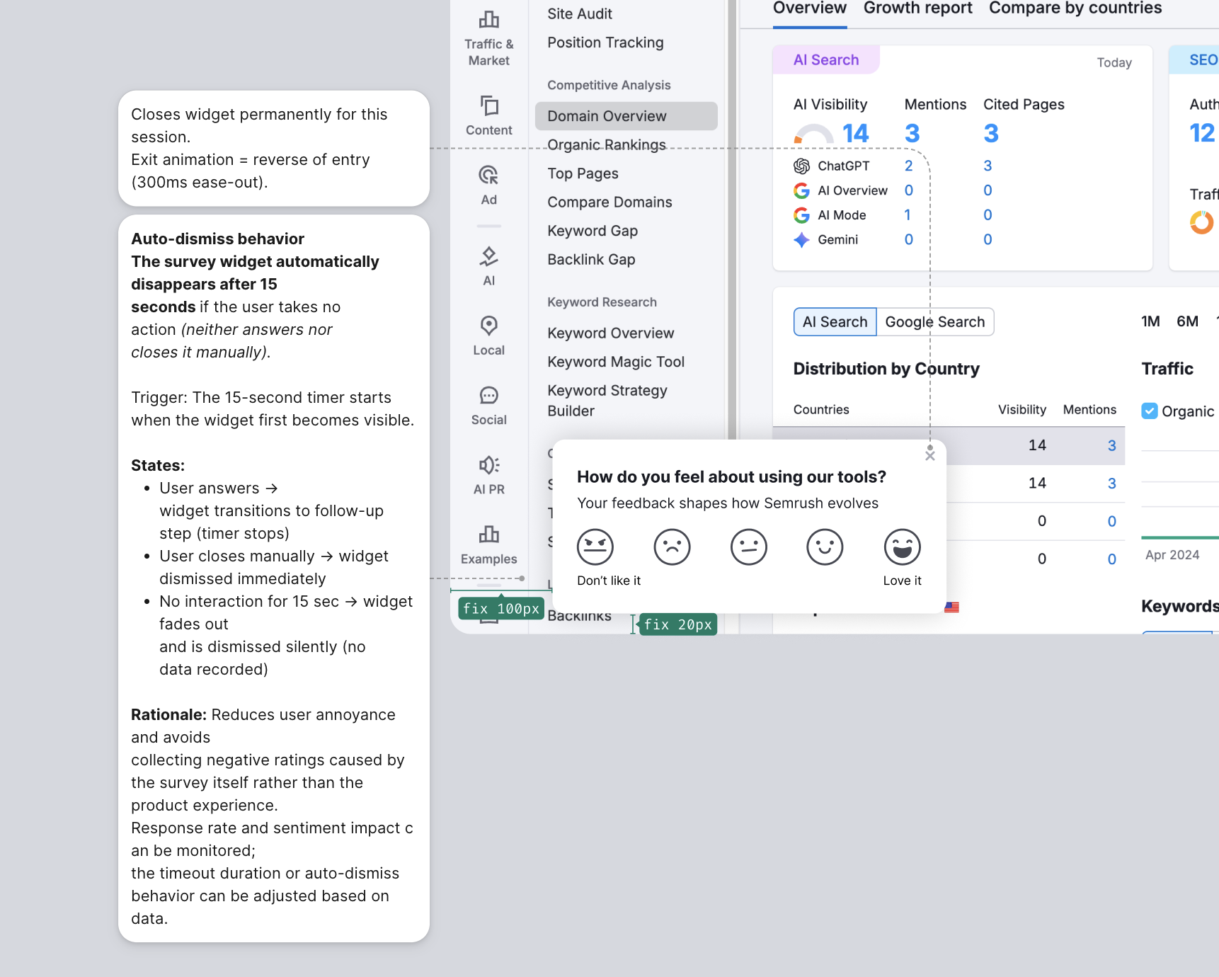
Bottom-left position
The right side of the screen was already occupied by chat and help widgets. Bottom-left was the only uncontested real estate.
Custom SVG emoji, not stars
Stars generate automatic "4 out of 5" responses — a known cognitive bias. Emoji with faces produce more honest, distributed data.
Follow-up for all scores
Not just detractors. Promoter insights are valuable too — understanding why someone loves a product is as useful as knowing why they don't.
No validation on empty text
Optional comment is optional. Adding a required field for the comment would have increased abandonment. Friction kills feedback.
Time-based trigger
Shows after N minutes of activity, not after a specific action. This samples across all user types rather than just users who completed a particular flow.
Process — 8 Iterations in 3 Weeks
-
v1–v3
Research, requirements, initial prototype
Stakeholder mapping, anti-pattern research, first working React prototype with all states.
-
v4
First video demo to team
Shared a video walkthrough instead of scheduling a sync. Stakeholders could see the flow without a meeting.
-
v5
Team feedback round
Removed the Skip button (reduces response quality). Adjusted colors to match design system tokens.
-
v6
PM feedback round
Removed collapsed state (unnecessary complexity). Moved placement from Dashboard to Domain Overview — higher-intent page.
-
v7
Copy finalization with UX Writer
Ran dedicated sessions with PM present. Every word of the survey copy was deliberate.
-
v8
Final design + design mentor review
Custom emoji with hover animations. All states documented. Final quality check session with design mentor before handoff.
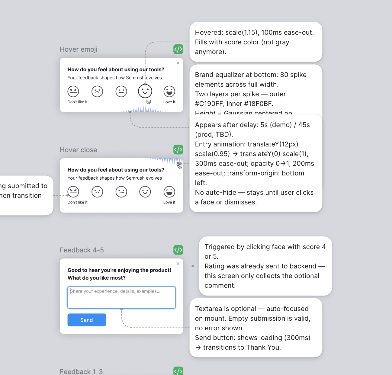
How I Work in Figma — Dev Handoff
Every state, animation, and edge case is annotated next to the design in Figma. Animation timing and easing, exact placement (with red fix stickies for pixel adjustments), trigger logic, auto-dismiss behavior — all written down so the dev team can ship without a sync meeting.
Deliverables
Results
Handoff went smoothly — few clarifying questions during development, and I stayed available for the ones that came up. PM collaboration feedback: "meaningful briefing approach" and "accelerated the project." Each of the 8 iterations is logged in context.md with the stakeholder name, the request, and the reasoning — full traceability.
What I'd Do Differently
Attend the analytics meeting from the start. Understanding the measurement infrastructure earlier would have let me design better analytics events on the first pass, rather than adjusting them in later iterations.
Interactive Demo
The widget appears bottom-left — same position as in production. Hover the emoji faces to see the equalizer animation, then click through all states: rating → follow-up → thank you → auto-dismiss.