Guests and Invites
Guest management rebuilt around free external collaboration, and an invite widget that stops asking people to type a colleague's address from memory.
Where it started
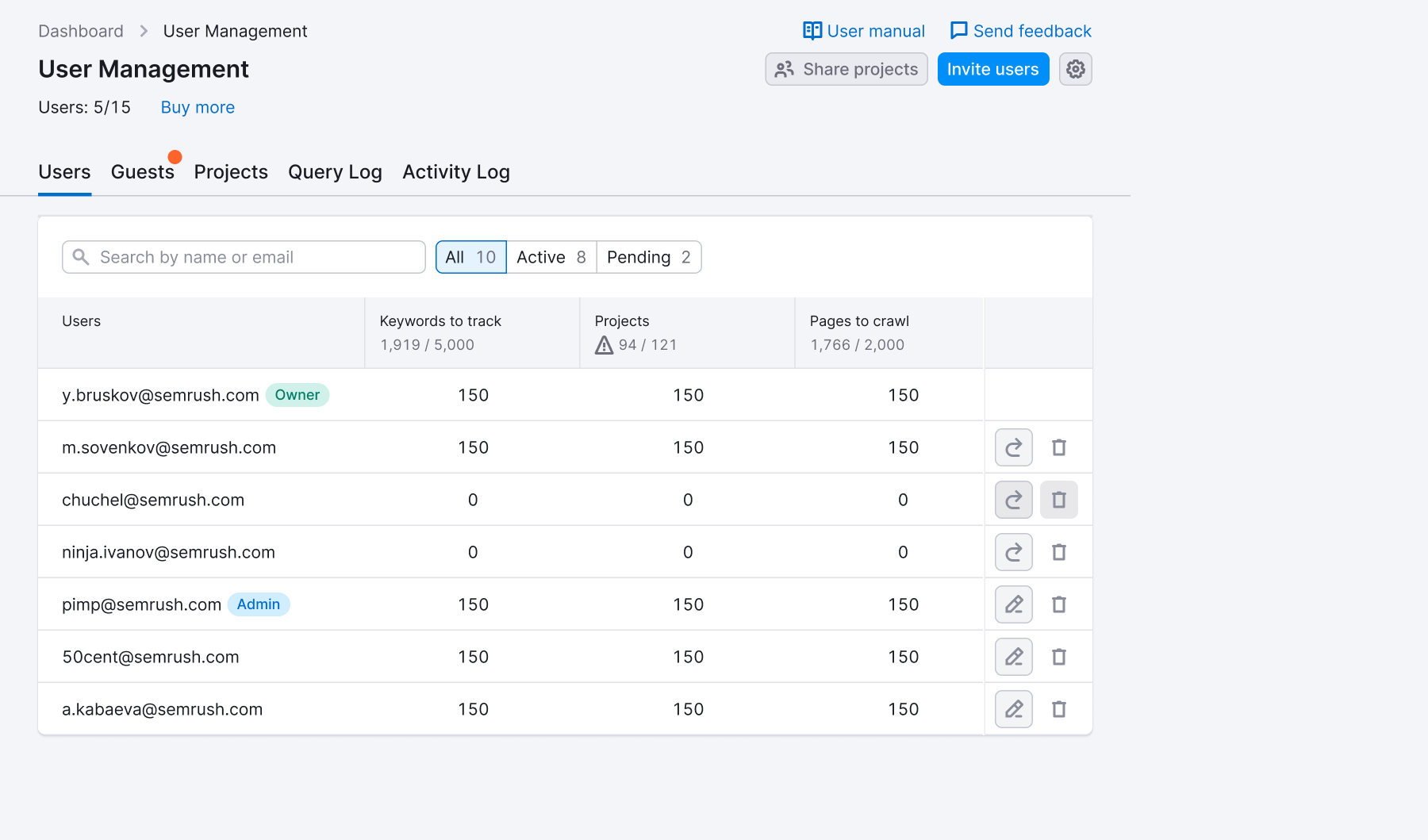
A guest is someone your assets get shared with. They take no seat, they cost nothing, and for a lot of accounts they are the whole point — an agency's clients, a company's contractors, the boss who wants to look at a report. The feature existed, but it was built as a conversion funnel: the list sat collapsed on top of the Users list, and the loudest thing in it was an invitation to turn a guest into a paid licence.
Two things were true at once. The people using it didn't want to buy anything — they wanted to see who has access and take it away. And the conversion the UI was built around wasn't happening.
- 90% of guest-related support requests are “remove this guest” — there was no way to do it yourself.
- 40% can't see which assets a guest has access to; the UI showed a count, not a list.
- Guests get stuck: delete the asset and the share isn't always cleaned up.
- People mistake guests for paid users and assume they're being charged for them.
- Support removed guests by hand, one at a time, for accounts where that is a day's work.
What the funnel showed
I mined 26 support cases before doing any design work — real language, real pain, not assumptions. Then I pulled the conversion funnel with the Analytics Lead, across four months of traffic.
Where do users drop off?four months of traffic across the legacy invite flow
- Opened the guest dropdown 100%
- Clicked “Invite guest” 6.5% · 6.5% step
- Reached the invite widget 0.32% · 4.9% from previous step
- Completed the invite 0.22% · 70% from previous step
Guests are free collaborators, not conversion targets.
What I set out to do
- Show which specific assets are shared with each guest, not just how many.
- Let people remove a guest themselves, in the fewest possible clicks.
- Lead with the collaboration value; keep monetisation as a secondary, quiet option.
What shipped
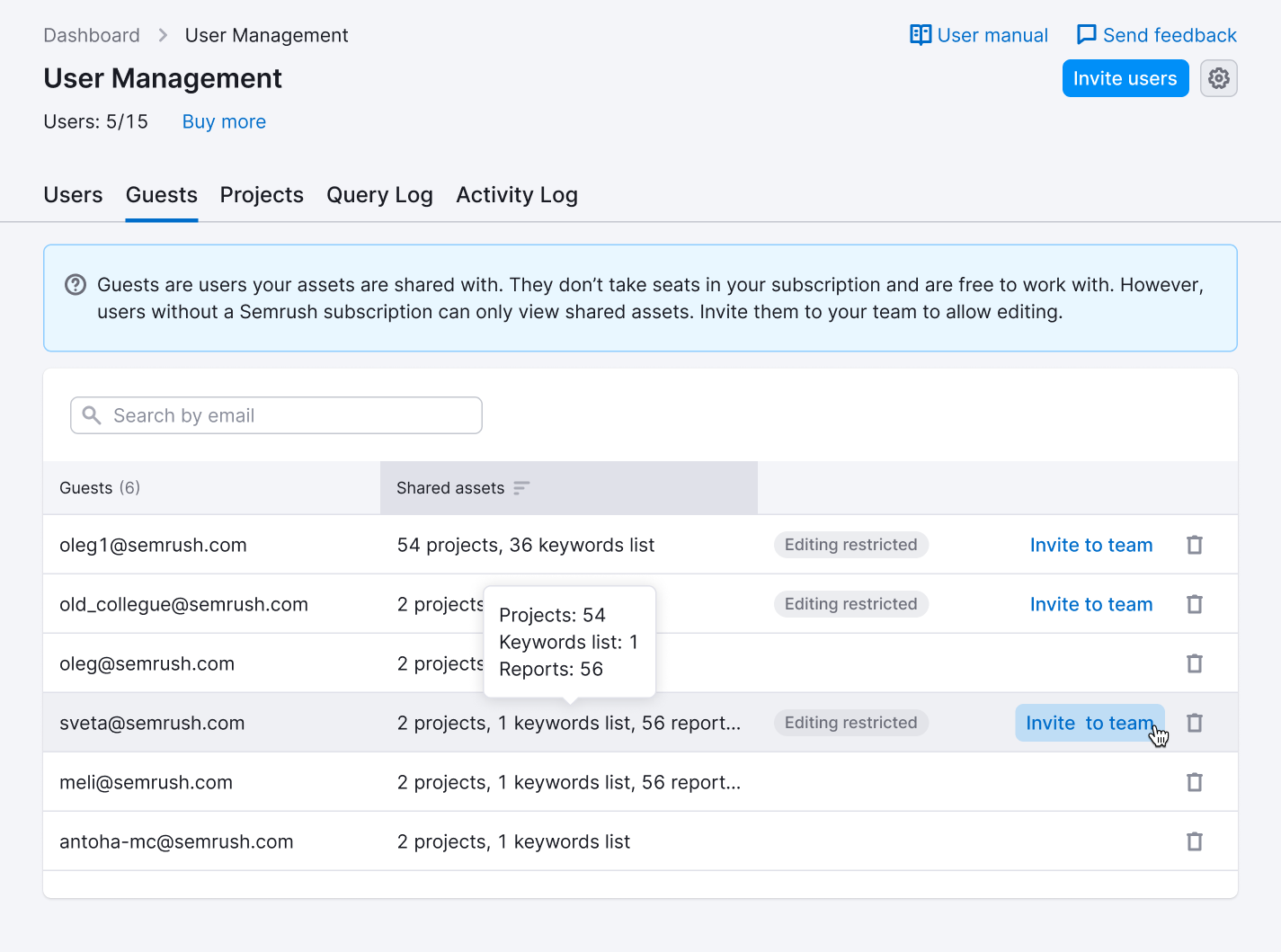
Guests moved out of the dropdown and into their own tab — external collaborators as a first-class part of the account, not a footnote on the Users list. Each row names the guest, lists what they can reach, and carries the two actions that matter: remove access, or, if they are limited to view-only, invite them to the team.
The removal is two steps on purpose. The confirmation names the guest and counts exactly what they lose, because the whole point is that this click used to belong to support.

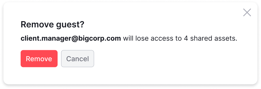
11.5% of visitors ever opened the guest list. In its own tab, 28% do.
Along the way the design lost a few things it started with: a Subscription type column that became a single “Editing restricted” tag, a yellow feature popover that became a quiet dot on the tab, and hover-only buttons that became buttons you can always see. Every state, edge case and piece of copy went to dev annotated — including the accounts where the guest list runs long enough that bulk removal becomes the next conversation.
Suggests in the invite widget
The second piece came out of the CJM. Mapping the collaboration journey, one pattern kept repeating: people share with a small, recurring set of the same colleagues — and then type those addresses from memory, every single time. Nothing in the brief said to fix it. I brought it to the Head of Product as a low-effort conversion improvement and got the go-ahead to design it.
The widget suggests the people you share with most often, ranked by how much you've shared with them. One click adds an address; the list stays open so you can pick several. Same-domain colleagues surface naturally at the top — the email itself shows the domain, so there's no need to label them.
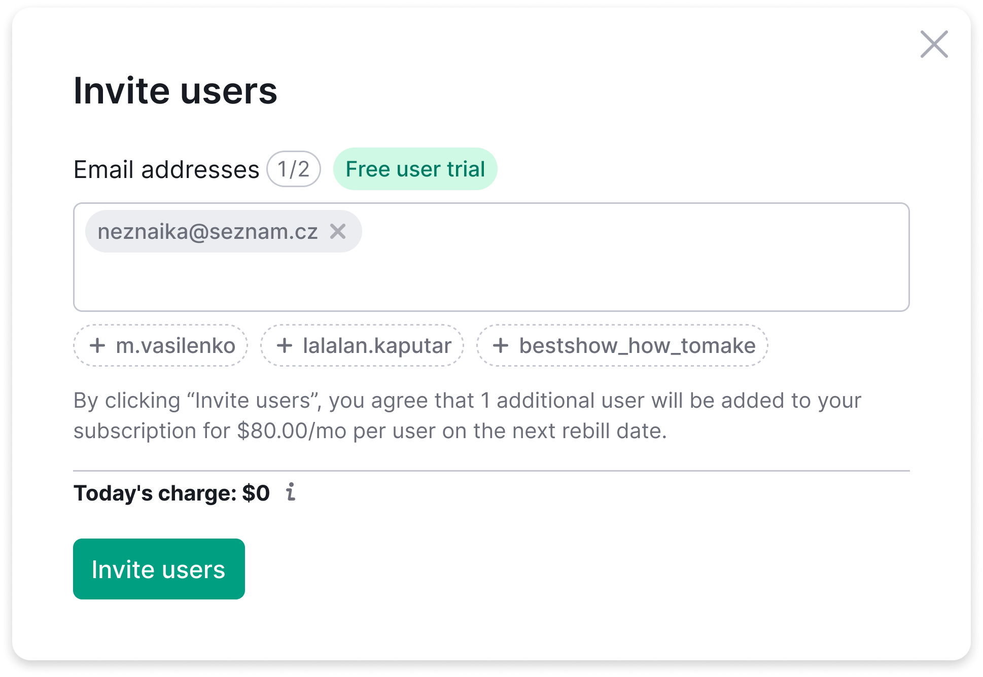
- Up to three suggestions at a time, ordered by sharing frequency and capped at a shortlist.
- Click adds the address as a tag and drops it from the suggestion row; backspace on an empty field puts it back.
- The wording avoids the word “guests” entirely — single-seat plans have no such concept, and the widget is the same widget for everyone.
- “You share with them often” explains the suggestion, so it doesn't read as the product guessing.
- A feature popover on the “Free user trial” tag carries the part people miss: inviting teammates costs nothing during the trial.
Three directions, side by side
I built three takes on the same idea and walked the team through all of them, rather than shipping the first one that looked right. The dropdown was picked to go forward.
- Chips. Tag-style suggestions under the input. Compact, quiet, and the easiest to fit into the existing widget.
- Suggest dropdown. An overlay under the input, headed “You share with them often”, multi-select without closing. The Head of Product's pick — cleaner when money is on screen.
- Inline tags. Suggestions living inside the textarea itself. The smallest footprint, and the most likely to be missed.
The widget, running
A vanilla-JS port of the widget — same input behaviour, same suggestion mechanic, same animations as the prototype that went to dev. Click a chip, type an address and press Enter, or backspace an empty field to take the last one back.
Suggests lift the purchase invite: 26.60% against 22.65%. Plus 3.95 points.
What it did in production
Suggestions went live on 23 April. Analytics compared the two weeks before with the two weeks after, split by purchase and trial, counting a conversion as a successful invite within ten minutes of seeing the widget. The before-cohort is everyone who would have been shown suggestions under the same rules — the closest thing to a control when the feature ships to everyone at once.
- Purchase: it works. People who saw suggestions converted at 26.60% against a matched baseline of 22.65% — plus 3.95 points. In weeks three and four the effect held: 24.98% for people who saw suggestions, 9.22% for people who didn't.
- They punch above their weight. Suggestions appear on 12.06% of purchase widget views, and those views produce 29.47% of every successful invite — two and a half times their share.
- Trial: not proven. Exposed users beat their own historical baseline, 4.34% against 3.14%, but they sit below the 5.47% of people who saw no suggestions that same fortnight. Positive against its own past, inconclusive against its neighbours — so it isn't counted as a win.
- No harm anywhere. The non-suggest groups stayed flat through both windows, which is what makes the purchase gap believable rather than a seasonal wobble.
About one in eight people who invite after seeing suggests actually picks a suggested name.
That last number is the uncomfortable one, and it's the reason the feature isn't finished. The conversion is up, but most people still type or paste the address with the right name sitting one click away. Either the chips don't read as clickable, or the habit of typing is stronger than the offer to skip it. Not a data problem — a visibility and affordance problem, and the next thing to design here.
The verdict was to keep it on production for purchase, and to stop short of calling trial validated. The people inviting during a trial aren't the ones stuck on an address; the friction being removed wasn't what stood in their way.
How it got there
Eleven iterations on the widget, six on the guest list, each one delivered as a short video walkthrough so stakeholders could see the flow without a meeting. The first suggestion chips carried avatars and names and were told, correctly, that they were too heavy; they became email-only. The dropdown alone took six passes on height, overlay behaviour, button visibility and header copy. Copy went through dedicated sessions with the PM and the UX writer, and the mechanics were written out in English next to the Figma file — states, transitions, animation specs — so dev didn't have to ask.
Some questions were settled on the way and stayed settled: what counts as “frequently used”, whether same-domain colleagues get their own group (no — the email already says it), how the suggestion explains itself, and whether the guest list ships in pieces or all at once (all at once: a table without removal solves nothing).
Taking the push out cost the invites. Putting the push back isn't the fix.
After release — emphasis on invitation
The guest tab shipped and did what it was designed to do: guests became visible, and removal became self-serve. It also did the thing I had signed off on — with the upsell demoted, the invite rate fell further. Visibility up, conversion down.
The follow-up brief was narrow and awkward: raise the guest-to-invite rate without going back to the version everyone had just agreed was too pushy. People already read the product as upsell-everywhere, so a second round of pressure would spend goodwill to move a number.
My read: conversion didn't fall because the offer got weaker. It fell because the target action stopped being legible. The old UI said the wrong thing loudly; the new one said the right thing in one flat paragraph with no hierarchy — and the eye slides off it. Four things to fix, none of them “make it louder”:
- Rewrite the notice so the action it wants is obvious at a glance.
- Make the “Editing restricted” tag carry weight instead of reading as a utility label.
- Make “Invite to team” heavier than the trash icon — right now the destructive action wins the row.
- Don't show the notice at all when nobody in the list is restricted.
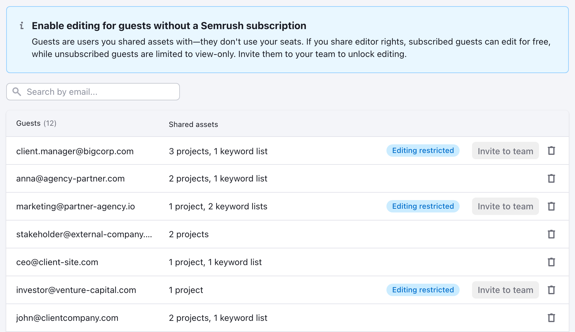
- The title does most of the work. One bold line turns a block of explanation into an offer you can read at a glance. The rest is trim on top of it.
- Colour goes to the status, shape goes to the action. The tag turns blue, the button becomes a real button but stays neutral grey. One signal instead of two — and the invite stops losing the row to a trash icon.
- The notice disappears when there's nothing to invite. If every guest already has a subscription the banner is noise. Hiding it also means that when it shows up, it means something.
- No manufactured urgency. No red, no counter, no “2 days left”. If the lift doesn't come from clarity, it's the first version again with better copy.
Both versions live side by side in a working prototype behind a switch, so the team argues about them on the same screen instead of in a deck. At the time of writing the variant is in design, not yet released.
Interaction States & Edge Cases
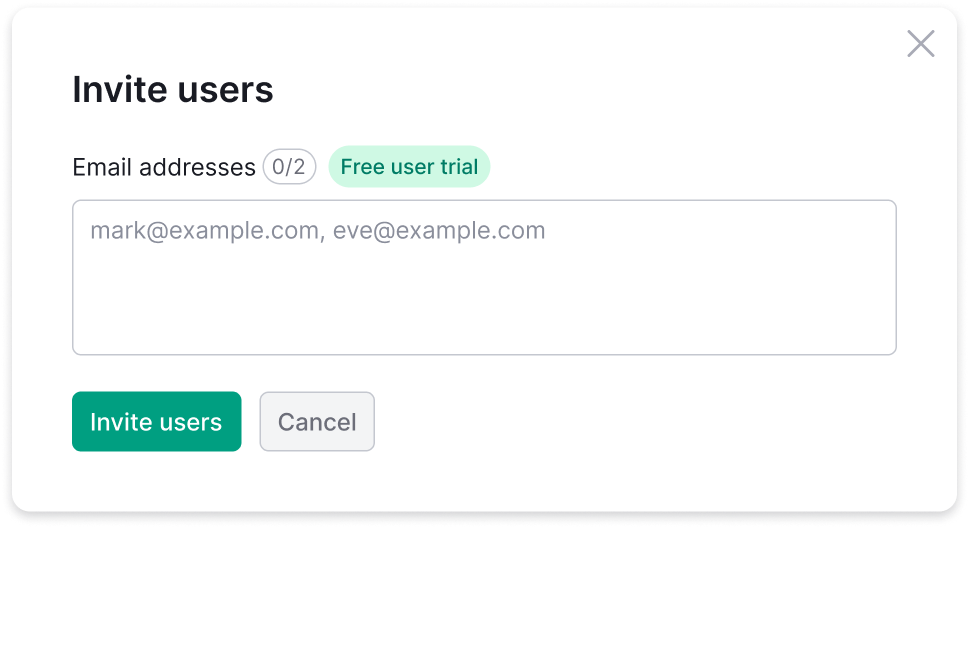
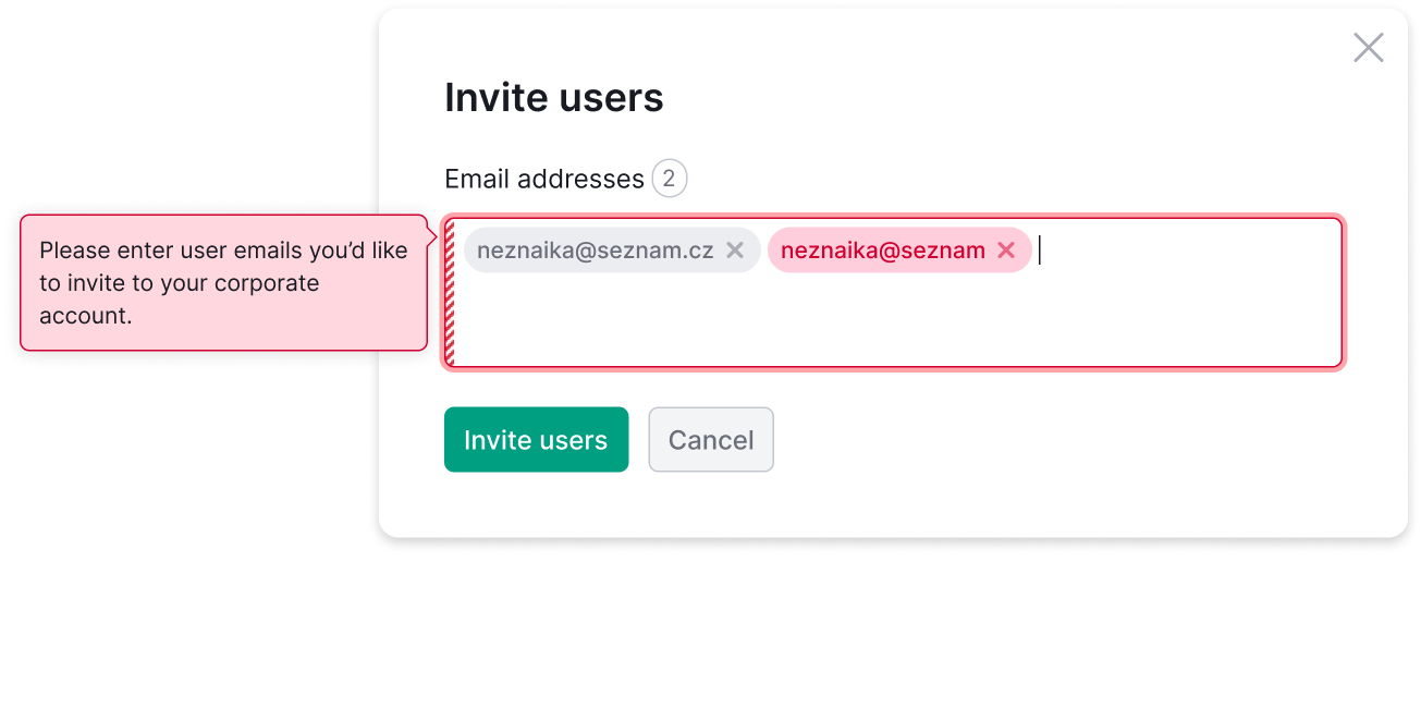
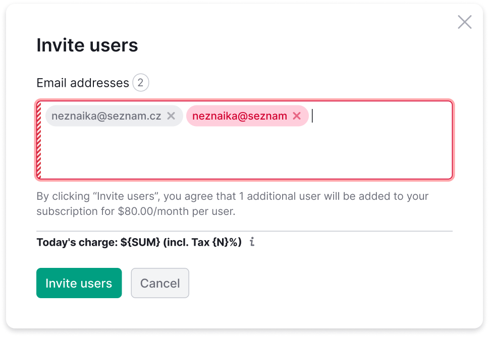
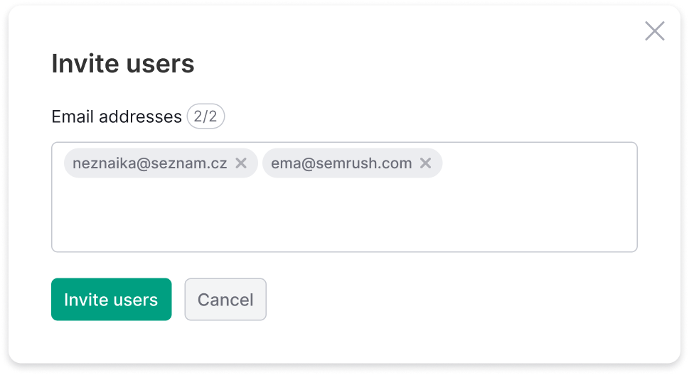
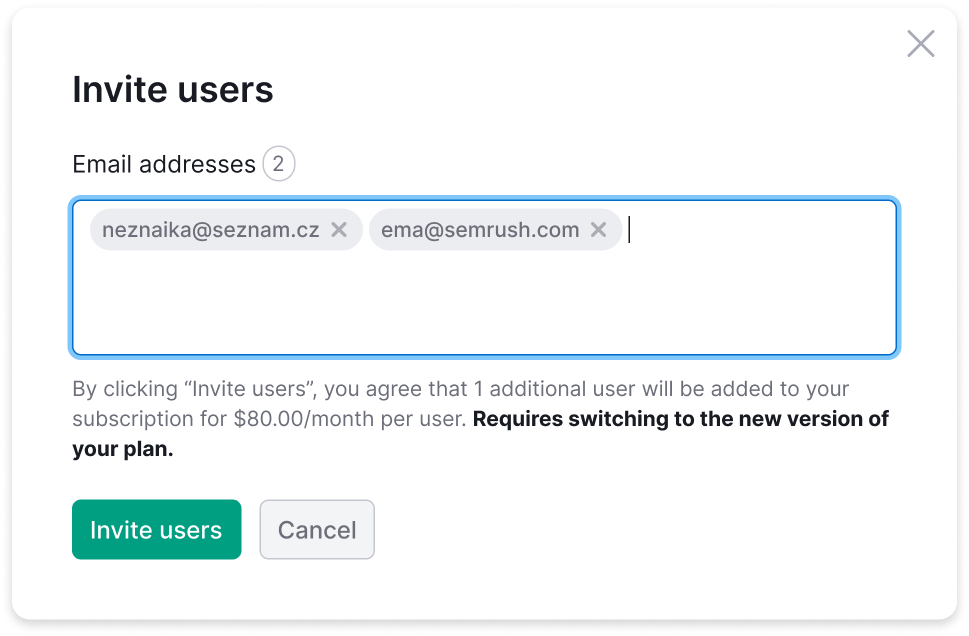
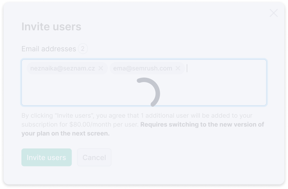
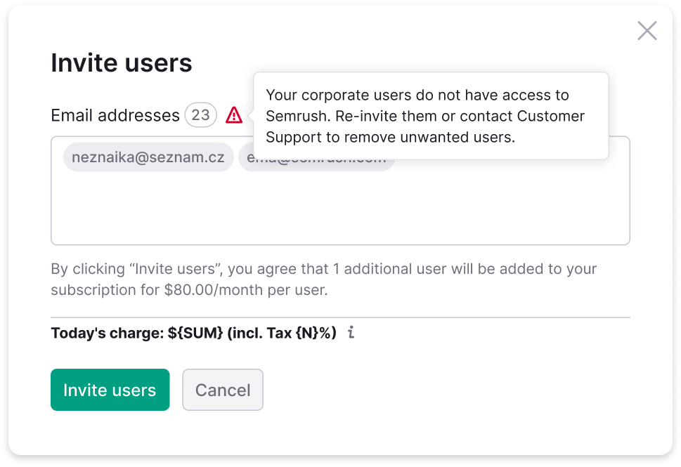
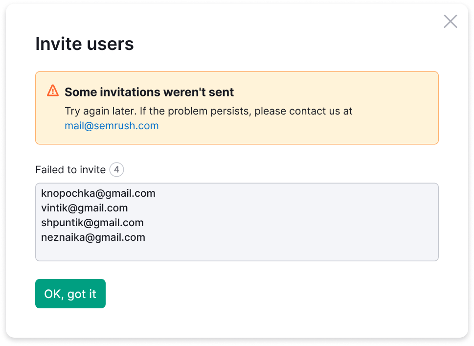
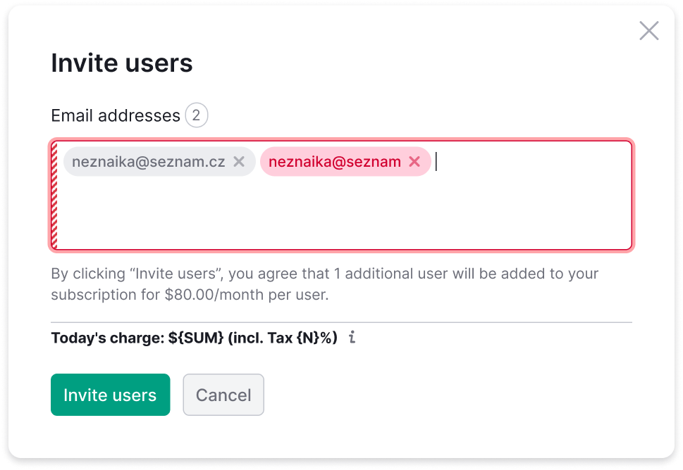
A sharing widget looks simple until real billing and permission rules meet live user data. During design and specification, every boundary condition, error state, price calculation, and microcopy scenario was mapped and designed upfront.
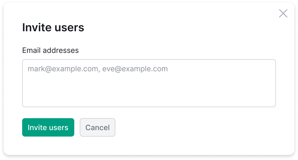
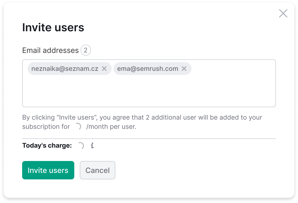
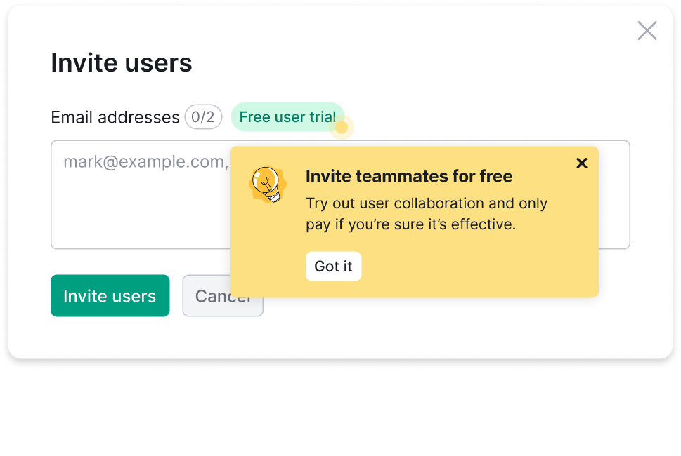
What the numbers say
- The list gets looked at. 11.5% → 28% of User Management visitors open it. That was the first goal: make the access perimeter something people can see.
- The suggestions work where money is involved. 26.60% against a 22.65% baseline on purchases, +3.95 points, holding through the second fortnight. On trials the signal is inconclusive. Kept on production for purchase.
- The invite rate fell once the upsell was demoted — measured against the 0.22% end-to-end baseline. That's the whole reason for the follow-up round above.
- Still open: the share of removal tickets that leave support, and click-through on the suggestion block per invite.
- Guardrails on the follow-up: time on the tab shouldn't jump (that reads as confusion), “what is a guest, am I paying for them?” shouldn't come back (the messaging got aggressive again), and the removal rate shouldn't fall (that's still the job most people came for).
What I take from it
Giving guest management its own space changed how people relate to the feature — a tab you can go to, instead of a dropdown you have to find, and two and a half times as many people go to it. Transparency about what is shared turned an anxious gap into something an account owner can act on, and self-serve removal moved the highest-volume support request out of support entirely.
The suggests came from noticing, not from a brief: people were typing the same addresses from memory, and sharing history already knew all of them. That kind of work only lands if you bring the trade-offs with you — three directions side by side, and a recommendation already in hand.
The follow-up taught me the other half. Taking the push out did cost invites, and the honest reading is that a value-first screen still has to name the action it wants. The fix isn't pressure coming back through a side door — it's hierarchy: a title where the eye lands, colour on the status, shape on the action, and nothing on screen when there's nothing to do.
More cases