Multilogin Page A/B Experiment
Redesigned the session-limit page into a 2-step flow — turning a dead-end friction wall into a trial conversion moment.
The right amount of friction isn't a bug — it's a conversion lever.
Overview
Context
When a user account exceeds its allowed number of simultaneous active sessions, the platform shows a dedicated Multilogin page. This page exists at the intersection of two competing interests: it should create enough friction to discourage credential sharing and nudge users toward purchasing additional licences — but not so much friction that it drives them to churn entirely.
The original page handled both goals on a single screen. The hypothesis was that splitting the interaction into two steps — first acknowledging the situation, then presenting the commercial offer — would improve conversion without increasing churn.
Problem
Immediate upsell felt abrupt
Landing directly on an invite/purchase screen after a session block gave users no moment to understand what had happened. The ask felt premature.
No acknowledgement step
Users who hit the page hadn't necessarily decided to credential-share on purpose. The page assumed they had and jumped straight to monetisation.
Friction-to-churn risk
Any redesign that increases friction also carries churn risk. The experiment needed to prove the change was net-positive before rolling out.
Hypothesis
A 2-step flow — a friction/awareness screen first, followed by the upsell/invite screen — would give users a moment to process the situation before being presented with an offer. That moment of intent-building would increase the quality of users reaching the commercial step and lift the trial conversion rate.
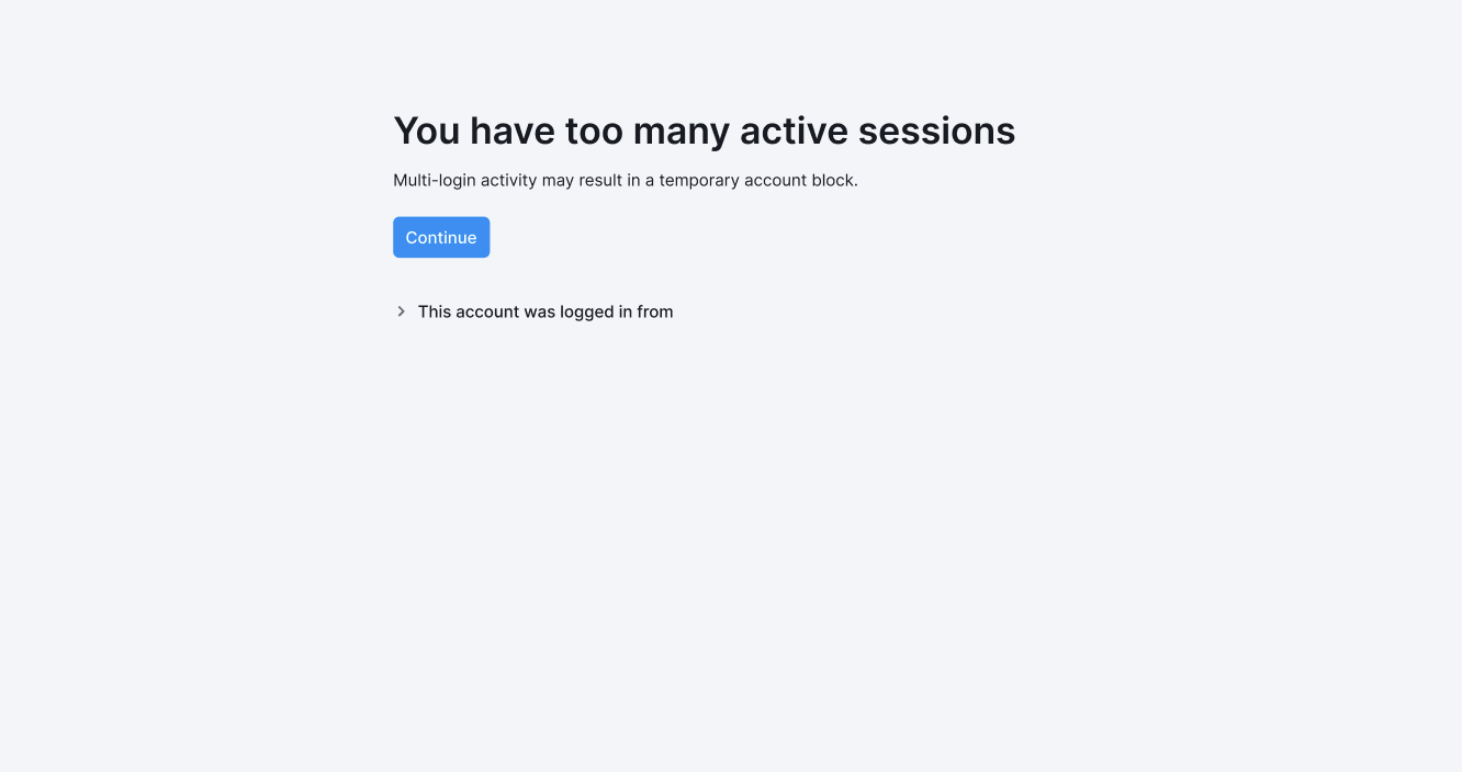
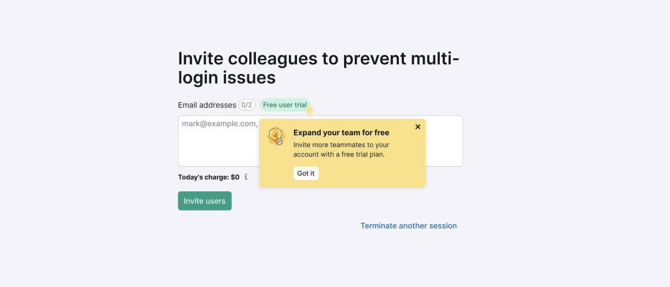
The Design — Before vs After
The control was a single-screen design. All information — the warning, the invite form, and the upsell — appeared at once, with no separation between the friction moment and the commercial ask.
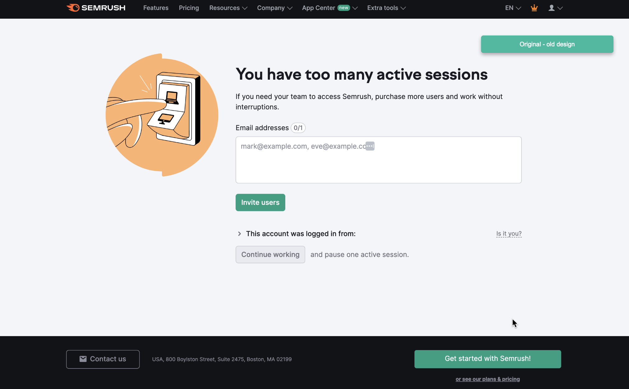
The variant split this into two distinct steps. Step 1 is a minimal friction screen — it names the problem and gives the user a single action: continue. Step 2 surfaces only after the user has consciously proceeded, and leads with the value offer (free trial for colleagues) rather than a hard upsell.
Experiment Design
-
→
Audience
All registered users who hit the Multilogin page. The experiment was sticky — the same user always saw the same variant across visits.
-
→
Split and sample
50/50 split. Statistically required sample: ~12,000 users per group (α = 0.05, power = 80%, MDE = +0.2pp). Expected exposure well exceeded this within the run window.
-
→
Duration
1 month active experiment, followed by a 14-day cooldown for post-exposure conversion observation.
-
→
Package test
Multiple changes shipped together. Accepted upfront as a holistic "package test" — impact attribution to individual changes was out of scope for this run.
Results
-
→
+35.5% relative uplift in trial conversion rate
Users exposed to the variant converted to trial at a significantly higher rate. The result was statistically significant — not noise.
-
→
+34% more trials started
The variant pushed substantially more users into the trial funnel. Volume increased, not just rate.
-
→
+3.1% relative uplift in trial-to-purchase rate
Trial-to-purchase conversion was directionally positive but not statistically significant on its own. Combined with the trial volume increase, this translated to a meaningful lift in total paid conversions.
-
→
No churn impact
No statistically significant change in churn rate between groups. The additional friction did not increase drop-off. The secondary success condition was met.
-
→
Positive MRR impact
The combination of higher trial volume and maintained conversion quality produced measurable additional monthly recurring revenue. The change paid for itself.
Why This Matters
This case is about the design of a friction moment — a place most designers would treat as a problem to minimise. The insight here is that friction, placed correctly, builds intent. Users who click through a warning screen have consciously decided to engage with what comes next. That decision changes the quality of the subsequent interaction.
The 2-step flow didn't just increase a metric. It changed the nature of the user arriving at the commercial offer: from someone interrupted mid-session to someone who has just acknowledged a situation and chosen to continue.