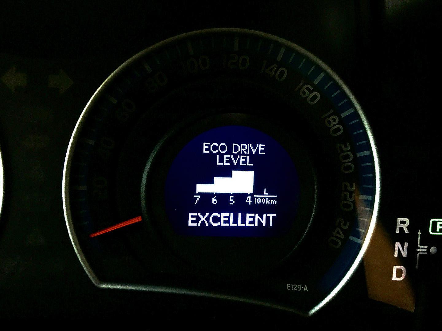
1. The hybrid version of the Toyota Auris praises the driver for economical driving. And it really works — I tested it on myself: when I don't see the word “Excellent” after finishing a trip, I feel like a spendthrift, and next time I try to drive more smoothly.
2. The fuel-economy infographic makes your brain work. The numbers are arranged from largest to smallest, while the bar chart itself runs from smallest to largest. The designers wanted to say: “Look how big your savings are!” — but they could have said “Look how little you spent!” and laid it all out in the order the brain expects, showing only the first bar.