Suggests
Displaying suggested email addresses in the Multi-invite widget to increase the number of invited colleagues.
Overview
Problems
- Users manually type email addresses when inviting colleagues — friction slows the process.
- Users frequently share access with the same people, but there is no "quick pick" mechanism.
- Same-domain guests are potential paid users, but there is no nudge to invite them specifically.
- Low conversion through the existing invite widget (per the GA4 funnel pulled with Analytics).
Goals
- Increase the number of users invited through the widget.
- Reduce friction in email entry by showing frequently used addresses.
- Surface same-domain guests as top candidates for invite.
- Improve invite UX — pick from suggestions instead of typing manually.
Solutions
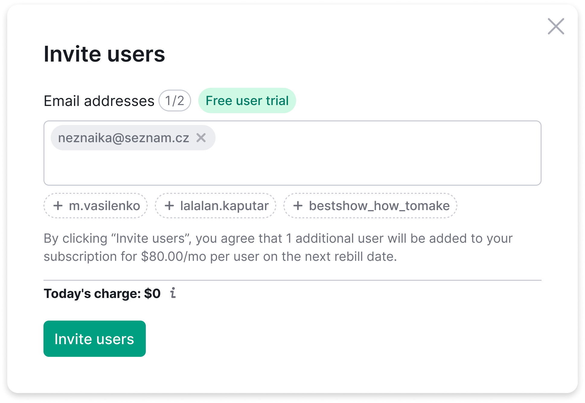
- Show suggested email addresses in the Multi-invite widget — people the user shares with most often.
- Top users by number of shared assets are ranked first; show up to 3 at a time.
- One click adds a suggestion to the invite list; the list stays open for multi-select.
- Embed the widget on User Management → Users tab.
- Attach a FeaturePopover "Invite teammates for free" to the "Free user trial" tag.
Metrics
- Growth in invites through the widget (vs baseline: 14 over 4 months).
- Reduction in time-to-invite.
- CTR on the suggested users block.
Questions raised & resolved
- Resolved How do we define "frequently used"? — Top-N by sharing frequency, capped at ~10 users.
- Resolved Do we separate same-domain from others? — No, the email itself shows the domain.
- Resolved How do we explain why we suggest? — "You share with them often."
- Resolved Do we use the word "guests"? — No, universal phrasing (single-paid plans don't have a "guests" concept).
Interactive Demo
Vanilla JS port of the Multi-invite widget — same input behavior, same suggestion mechanic, same animations as the prototype shipped to dev.
- Suggestion chips fade in 1.5s after mount, then sit below the input.
- Click a chip — adds the email as a tag, the chip disappears from the suggestion row.
- Type an email + Enter / comma — adds it as a tag.
- Backspace on an empty input — removes the last tag (and re-surfaces it as a suggestion if it was a suggested one).
- Once you have at least one tag, the price block animates open below the input.
Self-initiated from CJM
Three UI Directions — Reviewed with the Team
I prepared three different takes on the same idea and walked the team and design colleagues through them — to compare trade-offs together rather than ship the first version that crossed my screen. The Dropdown direction was picked to take forward.
Version A — Chips
Tag-style suggestions below the input field. One click adds the email. Clean and compact. Suggestions disappear when added, reappear with Backspace.
Version B — Suggest Dropdown
Overlay dropdown below the input. Header: "YOU SHARE WITH THEM OFTEN." Multiple selection without closing. Head of Product's preferred choice: "cleaner, especially when money is involved."
Version C — Inline Tags
Suggestions appear inside the textarea itself. Most compact, least visual noise. Smallest footprint in the UI.
Process — 11 Iterations
-
01
Started complex, simplified by request
First version had chips with user avatars and names. PM feedback: too heavy. Simplified to email-only chips.
-
02
Added dropdown variant
PM liked the dropdown idea better — "cleaner when money is in the picture." Added as Version B alongside chips.
-
03
Added inline variant
Explored chips inside the textarea itself. Most compact option — minimal disruption to the existing input design.
-
04
Iterated on dropdown details
Height, overlay behavior, button visibility, header copy — 6 sub-iterations on Version B alone.
-
05
Added FeaturePopover from design system
Found the right design system component for the "free" messaging. Annotated the connection between suggests and the trial state.
-
06
Full annotation in Figma + English mechanics doc
All states, transitions, and interaction mechanics described in English for the development team. Animation specs for the textarea expansion (108px fixed height for input + suggests).
Deliverables
Why This Matters
This case demonstrates something I value: design initiative from observation, not from briefs. I wasn't asked to solve this. I noticed the pattern while doing another task (CJM mapping), framed it as an opportunity, and delivered a ready-to-test solution.
The Head of Product didn't need to think through the trade-offs alone — I came with three directions explored, side-by-side, and a recommendation already in hand.