Value for Money Messaging
Users saw the team seat price and left. The fix wasn't hiding the price — it was contextualizing it. "68% cheaper than an individual subscription."
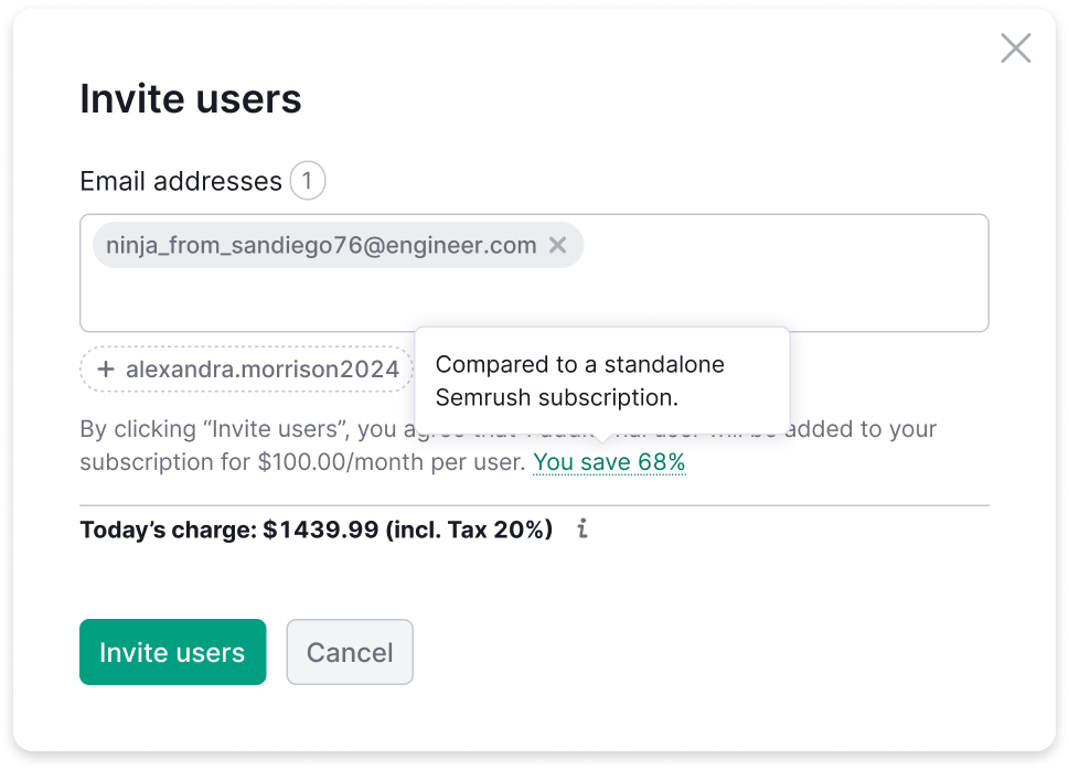
Don't hide the price. Explain why it's a deal.
Overview
Problem
When users reached the invite widget's payment step, they saw the team seat price and abandoned. The price felt expensive in isolation — there was no context, no anchor, nothing to compare it to.
A previous attempt showed too little emphasis on the charge — which caused refunds from users who didn't realize they'd paid. The new design needed to be honest about the charge and frame it as a good deal at the same time.
Solution
The team seat price is actually significantly cheaper than buying the same toolkit as an individual subscription. Users didn't know this because nobody told them. The fix: add a single contextual line in the price block that makes the comparison explicit.
Key Design Decisions
Payment state only
The free trial flow already emphasizes "free" prominently. Adding a price comparison there would be confusing. The savings message appears only when the user is about to pay.
Dynamic percentage per plan
The discount isn't the same for every plan. Pro, Guru, Business each have different individual vs. team pricing. Hardcoding "68%" would be wrong for most users — the percentage is calculated and injected dynamically.
No additional icon
The widget already had enough visual elements. Adding an icon for the savings message would increase visual noise without adding clarity.
Marketing Lead alignment
Copy that claims a percentage discount needs to be accurate and approved. Worked directly with the Marketing Lead to validate the framing and exact wording.
Process
-
01
Sync with Head of Product on paywall mechanics
Understood how pricing works across all plan tiers. Discovered the dynamic percentage requirement — different savings per plan. This was a detail I missed initially and caught in review.
-
02
Connect with Marketing Lead
Price comparison messaging is a marketing claim. Involved the Marketing Lead early to validate the numbers and approve the framing before it went to design review.
-
03
Multiple text placement iterations
Tested placement options: above the price, inline, below. Settled on inline within the price block — closest to the moment of decision.
-
04
Full flow documentation
Documented the complete invite flow with pricing context: top menu → popover → suggests → price → success. Video walkthrough for stakeholders.
-
05
A/B test setup with analytics team
Defined the test: value framing vs. price-only. Success metric: conversion from price step to completed invite.
Head of Product Feedback
Key Learning
The dynamic percentage was the detail I missed initially — I prototyped with a hardcoded "68%." The Head of Product caught it in review. Now I treat any pricing-related design as having dynamic values by default until proven otherwise.
This is a small lesson about the gap between what looks right in a static mockup and what needs to be true in production.